THE BACKSTORY
Branding my mum’s business kickstarted my dream of becoming a designer. Therefore even after almost a decade since I first created a logo for my mum using MS Powerpoint, I have never really stopped working on it.


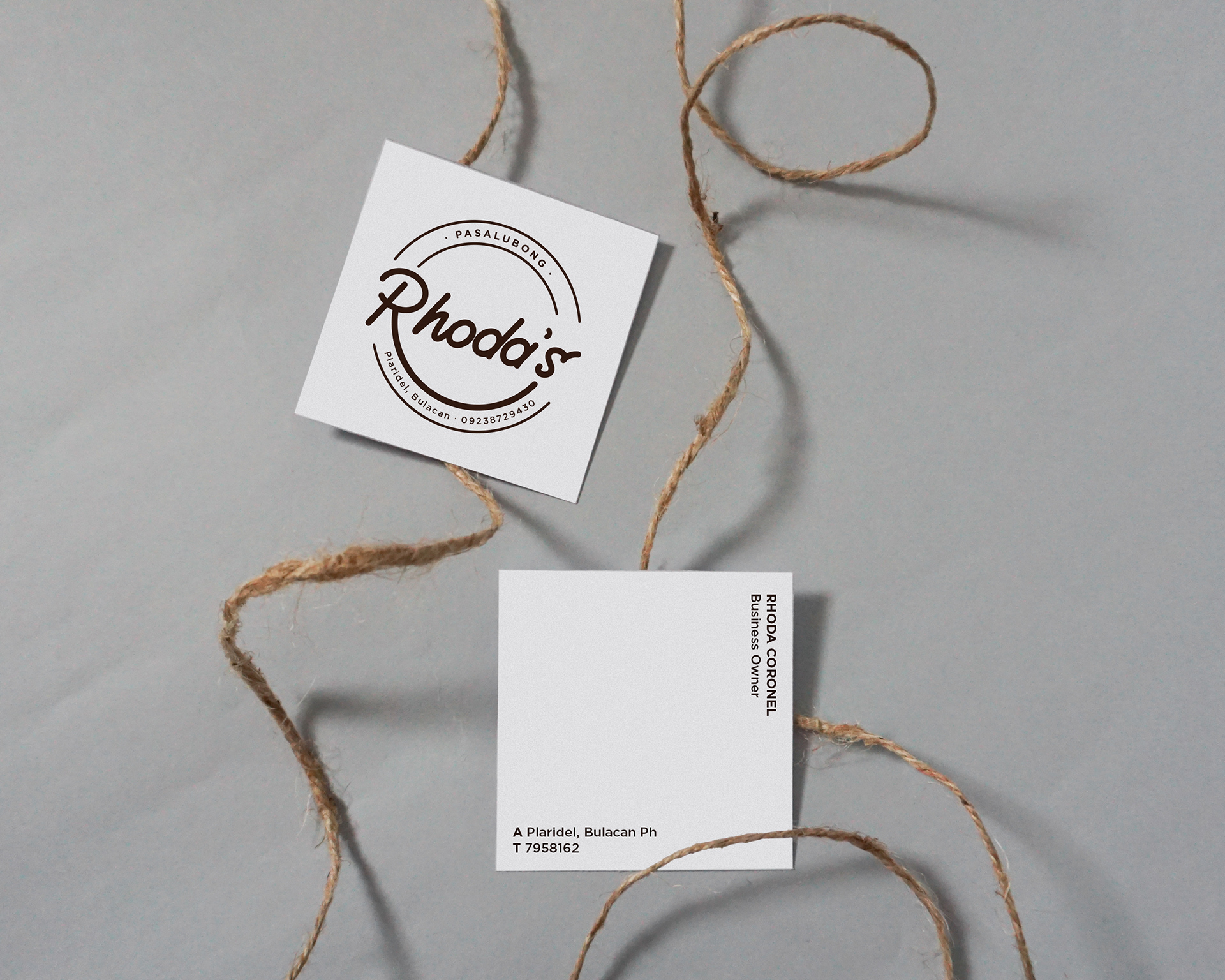
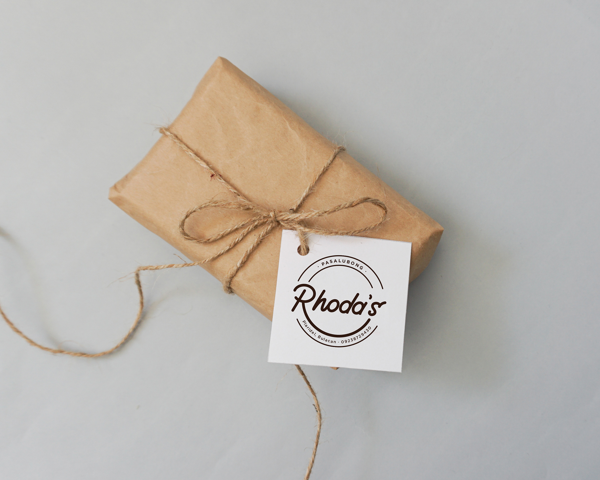
Shortly after design school, I found myself rediscovering design opportunities for my mum’s business. I chose the theme of monoline illustration to represent simplicity, which is evident in all of her recipes. The shape of the logo is inspired by the shape of one of her products, Leche Balls. Moreover, the golden yellow as the accent colour resonates with warmth, family and love.